

You may be looking at a familiar contradiction right now. Schedules are full, clinicians are busy, and the organization still isn't seeing the cash position it expected. The instinct is often to blame volume, payer mix, or staffing. In practice, the bigger problem is usually visibility.
A healthcare revenue cycle flowchart gives you that visibility. Not as a decorative process map, but as a working diagnostic tool. Used well, it shows where revenue stalls, where data gets distorted, where claims leave dirty, and where payments arrive short without anyone challenging them.
For a new hospital CFO, this matters fast. Revenue cycle problems rarely announce themselves in one dramatic event. They show up as small misses at registration, coding, eligibility, posting, follow-up, and collections. A flowchart lets you trace those misses across handoffs so finance, operations, and patient access are working from the same map.
Table of Contents
- Why Your Revenue Does Not Match Your Patient Volume
- The Complete Healthcare Revenue Cycle Flowchart
- Breaking Down the Flowchart Stage by Stage
- Key KPIs to Measure Flowchart Performance
- Common Failure Modes and Practical Fixes
- Beyond the Basics Where Most Flowcharts Fail
- How Clarity Fills the Gaps in Your Revenue Cycle
- Turn Your Flowchart into Financial Results
Why Your Revenue Does Not Match Your Patient Volume
A busy hospital can still leak revenue at almost every handoff. Registration collects incomplete demographics. Eligibility gets checked once and never revisited. Clinical documentation supports care but not billing. Claims go out with avoidable defects. Payments get posted, but no one asks whether the payer followed contract terms.
That's why patient volume and financial performance often drift apart.
I've seen leaders walk into finance reviews convinced they have a payer problem, only to find an operations problem hiding underneath it. The waiting room looks healthy. The ledger doesn't. The gap sits in the workflow between appointment and zero balance.
A healthcare revenue cycle flowchart works like a financial MRI. It doesn't just tell you the process exists. It shows the exact route a dollar is supposed to take, where staff touch it, where systems transform it, and where it gets lost.
Practical rule: If a step has no owner, no checkpoint, and no escalation path, it isn't a process. It's a leak.
A useful flowchart also exposes a hard truth for new CFOs. Most revenue cycle failures aren't caused by one catastrophic breakdown. They come from ordinary tasks done inconsistently across departments:
- Front desk drift: Staff verify some fields every time and skip others when the line gets long.
- Coding ambiguity: Clinical intent is clear, but billable documentation isn't.
- Posting complacency: Teams post remits quickly but don't compare them against expected reimbursement.
- Collections hesitation: Patient balances age because financial conversations happen too late.
The upside is that these issues are fixable once they're visible.
According to Qualify Health's analysis of revenue cycle mapping, mapping the healthcare revenue cycle flowchart can reveal a 15% increase in revenue by identifying hidden financial leaks across the end-to-end patient encounter. That's the practical value of the diagram. It turns "something is off" into "this handoff is failing, and this team owns the correction."
The Complete Healthcare Revenue Cycle Flowchart
Most leaders don't need another abstract description of revenue cycle management. They need a map they can use in meetings with patient access, HIM, billing, and finance without translating the process every time.
Start with the full route from first contact to final patient balance. That route usually includes pre-registration, registration, charge capture, claim generation, adjudication, payment posting, denial handling, and patient collections. Each step sounds straightforward on its own. The complexity comes from the handoffs.
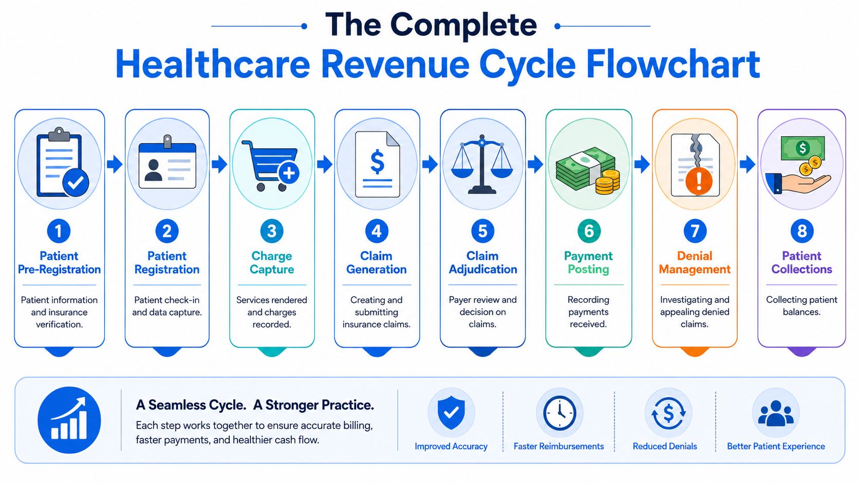
Use this flowchart as your operational blueprint. It gives every department the same "you are here" view. Finance can see where payment slows. Patient access can see where data quality matters downstream. Billing can pinpoint where a bad input at the front end becomes a denial at the back end.
At a high level, the diagram answers four executive questions:
Where does revenue begin
It starts before the encounter, when staff gather demographic and insurance data correctly.Where does revenue become vulnerable
It becomes vulnerable at every transfer between scheduling, registration, clinical documentation, coding, billing, and payer response.Where should finance challenge assumptions
At claim creation, payment posting, and any point where balances move without review.Where can teams recover missed dollars
In denied claims, underpaid claims, and patient balances that were never managed with clear policies.
For many organizations, the least appreciated box in the middle is charge capture in the revenue cycle. If services aren't captured accurately and tied to valid documentation, the rest of the diagram becomes expensive rework.
A good flowchart doesn't simplify the work by hiding details. It simplifies leadership by making those details visible.
Keep the diagram where operating leaders can use it. Bring it into denial review. Use it during payer escalation meetings. Pull it into month-end finance reviews. The value isn't in downloading it. The value is in using it to force better questions.
Breaking Down the Flowchart Stage by Stage
A CFO usually sees the problem first in the month-end close. Patient volume looks healthy, gross charges are up, and cash still misses plan. The flowchart explains why, but only if each box shows more than a handoff. It should show where revenue is created, where it leaks, who owns the fix, and what signal tells you trouble started.

A standard diagram often misses two of the highest-yield checkpoints: real-time eligibility and payer contract auditing. Leave those out, and the flowchart becomes a process map that explains work without exposing underpayments or preventable denials. That is the difference between documentation and diagnosis.
Patient access
Patient access covers scheduling, pre-registration, registration, and the first financial conversation with the patient, during which staff collect demographics, insurance details, authorizations, and expected patient responsibility.
Errors here travel far. A wrong member ID can become an eligibility denial. A missed authorization can become a medical necessity denial. A weak estimate can become bad debt that looked collectible on paper but never had a realistic path to payment.
I advise finance leaders to treat patient access like the front gate to cash. If bad data gets in, every downstream team spends more to correct it than it would have cost to prevent the error.
Eligibility verification
Eligibility verification is not a single task. It is a control point that should fire more than once. At scheduling, it confirms basic coverage. Closer to the date of service, it should confirm active benefits, payer changes, plan restrictions, and patient responsibility.
That second check matters. Coverage changes between appointment creation and service date happen often enough to hurt yield, especially in high-volume outpatient settings and around month transitions. A flowchart that shows only one eligibility touch gives leaders false comfort.
The stronger version includes real-time eligibility checks and exception routing. If coverage is inactive, out of network, or tied to a referral requirement, the account should not drift forward as if nothing changed.
Charge capture and coding
Charge capture converts clinical work into billable work. Coding translates documentation into claim-ready data. These are related functions, but they fail in different ways.
Charge capture failures create silent revenue loss. No denial appears because the charge never reaches the claim. Coding failures create visible friction. Claims go out with mismatched diagnoses, unsupported levels, modifier issues, or missing detail, then come back delayed, reduced, or denied.
For a closer look at how the workflow moves in practice, this walkthrough is useful:
Hospitals get better results when they separate these questions during review. Was the service captured at all? Then, was it coded correctly? Combining them into one broad bucket hides the source of the loss.
Claim submission
Claim submission should be predictable. If this stage feels unstable, the defect usually started upstream.
A strong claim submission process checks claim edits, validates required fields, confirms payer routing, and catches inconsistencies before the file leaves the system. The practical goal is simple: reduce preventable rework. Clean claims get adjudicated faster, cost less to manage, and keep A/R from aging for avoidable reasons.
This stage also deserves a tighter feedback loop than many organizations use. Rejections from the clearinghouse should feed directly back to registration, coding, or billing leadership within days, not weeks.
Payment posting
Payment posting records what the payer allowed, what was adjusted, and what shifted to patient responsibility. It also serves as one of the best places to spot underpayments.
Many teams post payments accurately and still miss revenue because nobody compares the remittance to contract terms. If the payer reimbursed below expectation, and staff posted the variance as routine, the system now reflects a clean transaction with the wrong financial result.
That is why payer contract auditing belongs on the flowchart. Payment posting tells you what happened. Contract review tells you whether it was correct.
Denial management
Denial management works best when it is built around root cause, ownership, and prevention. Appeals matter, but repeated denials from the same source usually point to a process defect that was never corrected.
A useful denial workqueue separates technical denials from clinical denials, authorization denials, registration denials, and timely filing denials. That structure changes the conversation. Patient access owns part of the fix. HIM or coding owns part. Billing operations owns part. Finance can then see whether labor is going toward recovery or just recycling old mistakes.
Operator's view: A denial queue shows today's backlog. A denial trend shows which department is creating next month's write-offs.
Patient collections
Patient collections start before the statement drops. They start when the organization sets expectations clearly, gives the patient a realistic estimate, and offers straightforward payment options.
Late-stage collection activity still has a role, but it is a weak substitute for early financial clearance. Hospitals that collect well at the front end usually have fewer complaints, fewer payment plan failures, and less bad debt tied to surprise balances.
For leaders who want tighter visibility into front-end yield, denial patterns, and cash conversion by stage, this healthcare revenue cycle analytics framework helps connect the diagram to measurable financial performance.
Reporting
Reporting is where the flowchart becomes a management system. Basic A/R totals are not enough. Leaders need reporting that shows registration accuracy, eligibility fallout, charge lag, coding edits, denial root causes, payment variance, and patient collection performance.
The trade-off is real. Too few reports leave blind spots. Too many create dashboards nobody acts on. The right reporting package answers one question at each stage: what is breaking, who owns it, and how much cash is at risk if it stays broken?
That is why I treat the flowchart as a live diagnostic tool, not a poster for onboarding. If reporting cannot expose missed eligibility checks or payer underpayments, the diagram is still incomplete.
Key KPIs to Measure Flowchart Performance
A CFO sees this pattern often. Patient volume is holding, providers are busy, claims are going out, yet net revenue comes in light and A/R gets older. In that situation, the flowchart is not a documentation exercise. It is a diagnostic tool for finding where cash leaks out before the month closes.
The mistake is tracking only end results such as total cash or gross days in A/R. Those matter, but they are lagging indicators. They tell you the outcome after the process has already failed. A useful KPI set attaches one or two measures to each stage, assigns an owner, and sets a threshold that triggers action.
Good KPI design also exposes gaps that standard flowcharts miss. If your scorecard does not measure real-time eligibility performance and payer contract variance, you are watching the visible parts of the cycle and ignoring two of the biggest recovery opportunities.
What to measure and why it matters
Each metric should answer three questions. What broke. Who owns the fix. How much revenue is at risk if the issue stays open.
That keeps the reporting package practical. A registration leader should see front-end accuracy, insurance discovery success, and eligibility fallout by staff, location, or payer. A billing leader should see clean claim rate, rejection causes, and filing lag. A CFO should see whether underpayments are being identified and recovered, not just whether payments were posted on time.
If you want a model for tying stage-level metrics to financial outcomes, this healthcare revenue cycle analytics framework is a useful companion to the flowchart.
RCM stage and corresponding KPIs
| Flowchart Stage | Primary KPI | What the KPI should reveal |
|---|---|---|
| Patient Access | Registration accuracy rate | Whether bad demographic and insurance data are creating downstream rework |
| Eligibility Verification | Eligibility-related denial rate and same-day recheck completion | Whether coverage was verified early enough and revalidated close enough to service |
| Authorization | Authorization hit rate and late-auth volume | Whether preventable technical denials are starting before care is delivered |
| Charge Capture and Coding | Charge lag and coding edit volume | Whether revenue is delayed or held up by documentation and coding defects |
| Claim Submission | Clean claim rate and rejection turnaround time | Whether claims are leaving ready for payment or returning for avoidable corrections |
| Payment Posting | Posting timeliness and unapplied cash volume | Whether posted cash reflects actual collections and whether exceptions are piling up |
| Contract Management | Payment variance rate and underpayment recovery rate | Whether payer reimbursement matches contract terms or money is being left behind |
| Denial Management | Denial recurrence by root cause and appeal yield | Whether the team is fixing upstream defects or reworking the same denials repeatedly |
| Patient Collections | Point-of-service collection rate and post-service recovery rate | Whether patient responsibility is being collected at the lowest-cost point in the process |
| Reporting | KPI review completion and action closure rate | Whether leaders are acting on signals instead of collecting dashboards |
The target should fit your operation. A community hospital, a multispecialty group, and an academic medical center will not share the same baseline. Copying an outside benchmark without looking at payer mix, staffing model, and system constraints usually creates noise, not improvement.
I advise new CFOs to watch trend direction first, then benchmark. If eligibility denials fall, charge lag shortens, payment variance reviews increase, and underpayments are recovered faster, the flowchart is doing its job. If those measures are absent, the diagram may still look complete while cash slips unnoticed through the gaps.
Common Failure Modes and Practical Fixes
Most revenue cycle problems are easy to describe and harder to diagnose. "Denials are high." "Cash is slow." "Patient balances keep aging." Those are symptoms, not causes. The flowchart helps because it ties the symptom back to the step where the breakdown likely started.
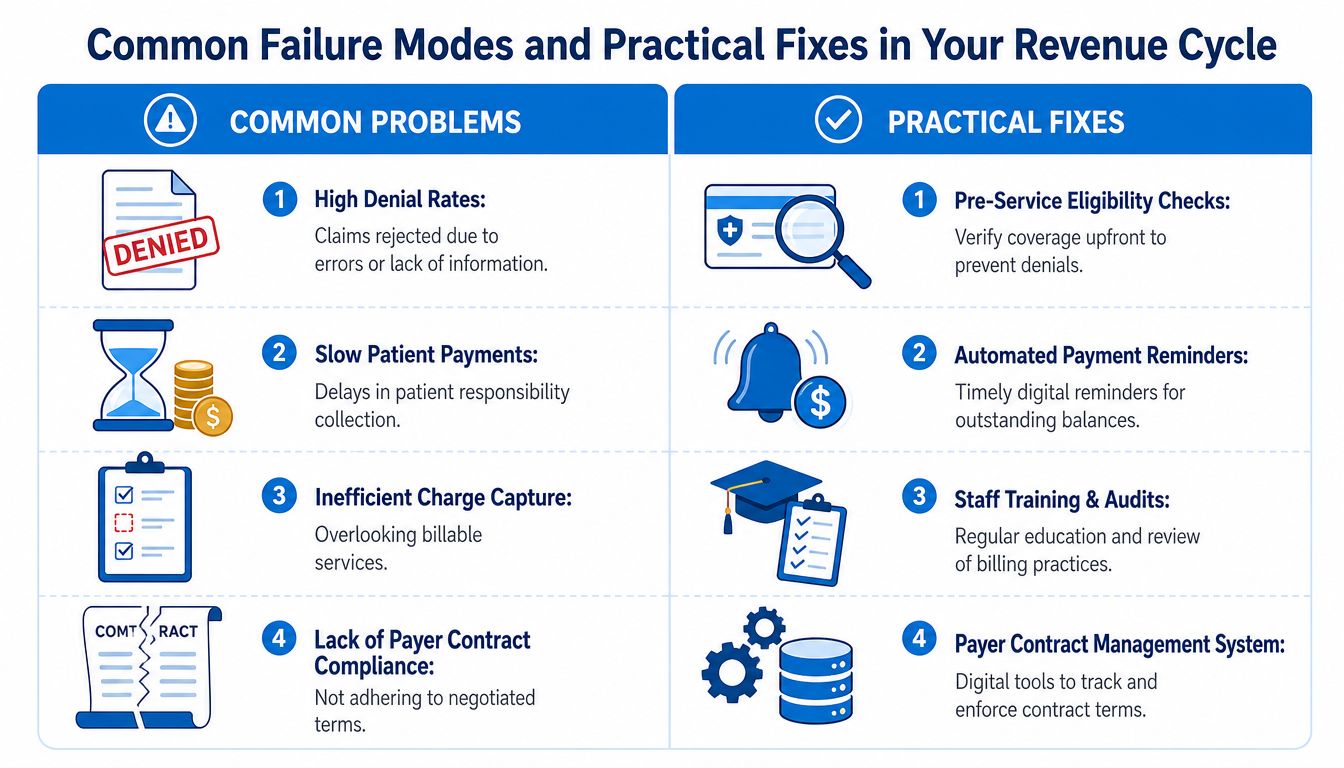
When the symptom is denial volume
If eligibility denials keep appearing, the root issue often isn't billing. It's stale verification logic. Teams checked coverage once, then assumed the answer stayed valid through the date of service and final claim.
The practical fix is to move from one-time checks to repeated checkpoints. Verify at scheduling, revisit before service, and confirm again when risk indicators appear. That's a workflow change, not just a software feature.
Other denial-related fixes are more basic but still common:
- For authorization misses: Build visible ownership and escalation before service.
- For coding defects: Audit provider documentation patterns, not just coder output.
- For filing delays: Shorten handoffs between charge release and claim submission.
When cash is slow even after claims are paid
This usually points to patient responsibility or unresolved secondary balances. Hospitals often improve front-end collections only after they've already built a large backlog of statements and follow-up work.
The fix is to tighten financial clearance and collect earlier. Staff need scripts, estimate visibility, and a standard collection posture. Late statements alone won't carry the load.
For organizations with aged balances and preventable write-offs, focused medical revenue recovery support can help close gaps without rebuilding the whole operation at once.
Fixes should match the failure point. Don't hire more denial staff to solve a registration problem.
When posted payments hide missed revenue
A less obvious failure mode happens after money arrives. Payments are posted correctly, but underpayments pass through because no one compares actual reimbursement against expected contract terms or internal logic.
Leaders get fooled by surface-level stability. The bank deposit exists. The claim is closed. The margin still erodes.
Practical fixes include:
- Exception queues: Flag remit patterns that don't match expected payment behavior.
- Contract-aware review: Compare paid amounts against payer terms before treating the balance as final.
- Closed-loop feedback: Send underpayment findings back to payer relations, posting teams, and finance.
That last point matters. A revenue cycle team that only closes tasks will miss recurring leakage. A team that loops findings back into the flowchart will keep improving it.
Beyond the Basics Where Most Flowcharts Fail
Most standard diagrams stop too early. They show a neat line from patient scheduling to payment posting, then imply the process is complete. For a CFO, that's the wrong mental model.
Two gaps matter more than most organizations realize.
The missing payer contract audit loop
Payment posting is not the end of the revenue cycle. It should trigger a review loop. Did the payer reimburse according to contract terms, fee schedule logic, and adjudication rules? If nobody asks that question, underpayments become normalized.
According to Experian's discussion of healthcare revenue cycle flowchart design, 70% of underpayments stem from contract misalignment rather than coding errors. That's a major blind spot because many simplified flowcharts frame underpayment as a coding problem or ignore it altogether.
The trade-off is operational. Contract auditing takes discipline, skilled staff, and systems that can compare expected and actual reimbursement. But the alternative is worse. You accept payer behavior as correct unless a denial forces review.
Payments need to be audited with the same seriousness claims are scrubbed.
If I were advising a new CFO on one redesign choice, I'd add a permanent feedback loop after payment posting. Not a periodic special project. A built-in cycle for underpayment detection and recovery.
The problem with static eligibility
The second gap is eligibility design. Traditional flowcharts place eligibility near pre-registration and then move on. That made more sense when coverage data behaved more predictably. It doesn't hold up well now.
The stronger model treats eligibility as dynamic. Coverage, deductibles, and benefit details can shift between scheduling and the date of service. If your flowchart doesn't account for that, denials will keep surprising teams that swear they verified coverage.
The practical implication is important even without repeating every metric in every meeting. Eligibility shouldn't be a single box checked once. It should be a control point that appears wherever coverage risk can change the financial outcome.
Standard flowcharts miss both of these issues because they prefer a clean line over a real one. Real revenue cycles loop back, branch, and challenge prior assumptions.
How Clarity Fills the Gaps in Your Revenue Cycle
A new CFO usually sees the same pattern within the first 90 days. Volume looks stable. Gross charges look fine. Cash still trails expectations because a few recurring failure points keep draining margin after the patient has already been seen. At that stage, the question is not whether to get help. It is whether you need broad outsourcing or targeted support tied to what the flowchart is showing you.

Used well, a partner fills specific control gaps without blowing up the structure you already have. If the map shows chronic eligibility denials, outside support can add repeated benefit verification and tighter front-end workflows while your internal access team stays focused on scheduling and registration. If the leak appears after payment posting, the better use of a partner is contract-focused review, underpayment identification, and payer follow-up that many hospital business offices do not have time to run consistently.
That distinction matters. Many vendors sell labor. A stronger partner adds discipline at the exact point where your flowchart breaks.
Clarity fits that model. Some organizations use it across fee schedule setup, billing operations, benefit verification, claim status follow-up, and payment posting. Others use it more narrowly, which is often the better financial choice. If one part of the cycle is underperforming, fix that part first and measure the lift before expanding scope.
Eligibility is a good example. Fox Group's review of healthcare revenue cycle process benchmarks notes that providers using continuous eligibility verification see fewer denials, which lines up with what many revenue leaders see in practice. A standard once-and-done check at scheduling misses coverage changes that happen before the visit. A partner can help build repeat checks at the points where financial risk changes, instead of asking your existing team to absorb another task with no redesign.
The same logic applies to payer contracts. If posted payments are consistently below expected reimbursement and no one has the bandwidth to compare allowed amounts to contract terms, recovery stalls. Specialized support gives you a way to audit those variances, pursue underpayments, and feed the findings back into the flowchart so the problem does not stay hidden in adjustments.
That is the practical value. Use a partner to close the gaps your diagnostic map exposes, not to replace functions that are already working.
Turn Your Flowchart into Financial Results
A healthcare revenue cycle flowchart should do more than explain the process. It should help you diagnose failure, assign ownership, measure performance, and recover missed revenue. That's the difference between a static diagram and a working financial control.
The strongest organizations don't stop at the visible steps. They build a loop for payer contract auditing after payment posting and treat eligibility as an ongoing checkpoint instead of a one-time task. Those two changes alone can shift the flowchart from descriptive to useful.
If your revenue doesn't match your patient activity, don't start with assumptions. Start with the map. Then test each handoff until the leaks become visible and fixable.
If you want a practical review of where your process is leaking, Clarity offers a complimentary consultation to assess your current revenue cycle and recommend a customized path forward. Whether you need full-service support or help in a few high-risk functions, their team can help turn your flowchart into cleaner operations and stronger financial performance.
No responses yet